
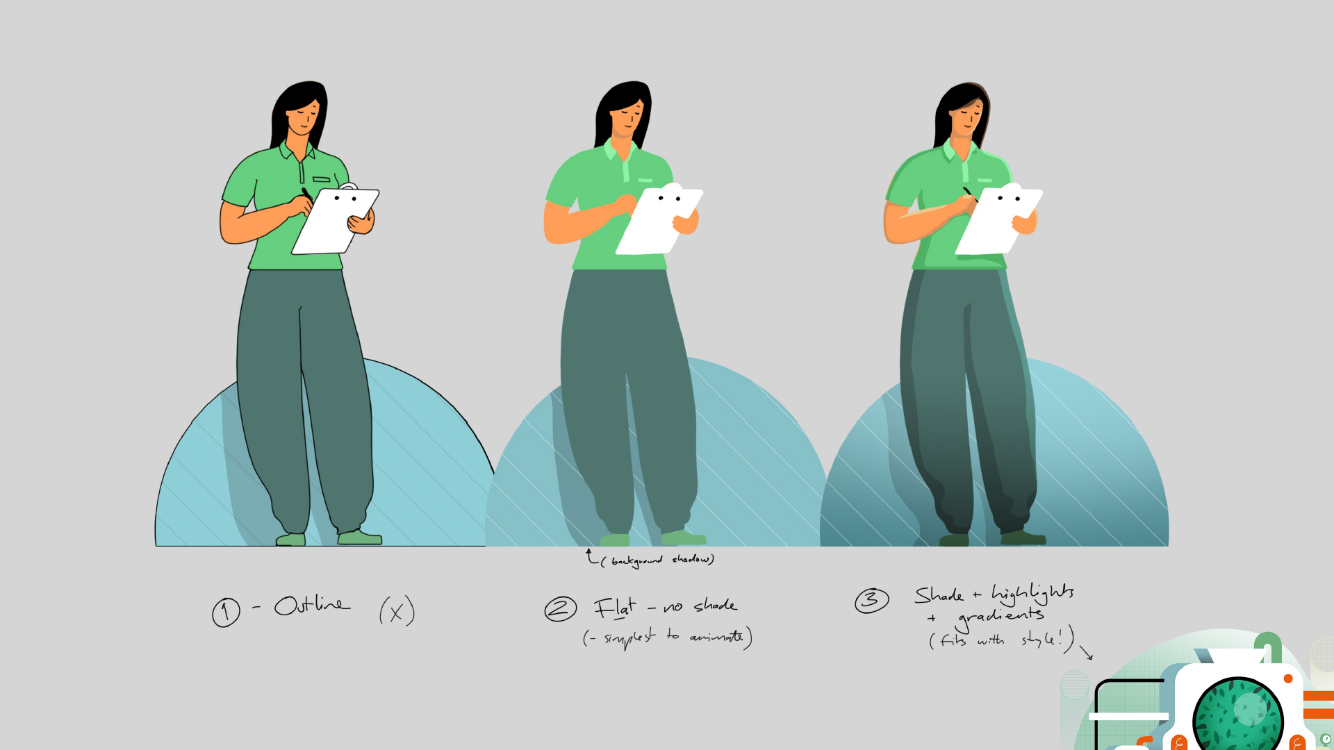
Style Setting
The campaign aims to establish Epidiolex as a unique brand that can make an impact on patients lives. So, when it came to the design, it was key to create a distinct, ownable style that's true to the corporate identity of the brand whilst also feeling human and simple enough to digest for the everyday consumer.


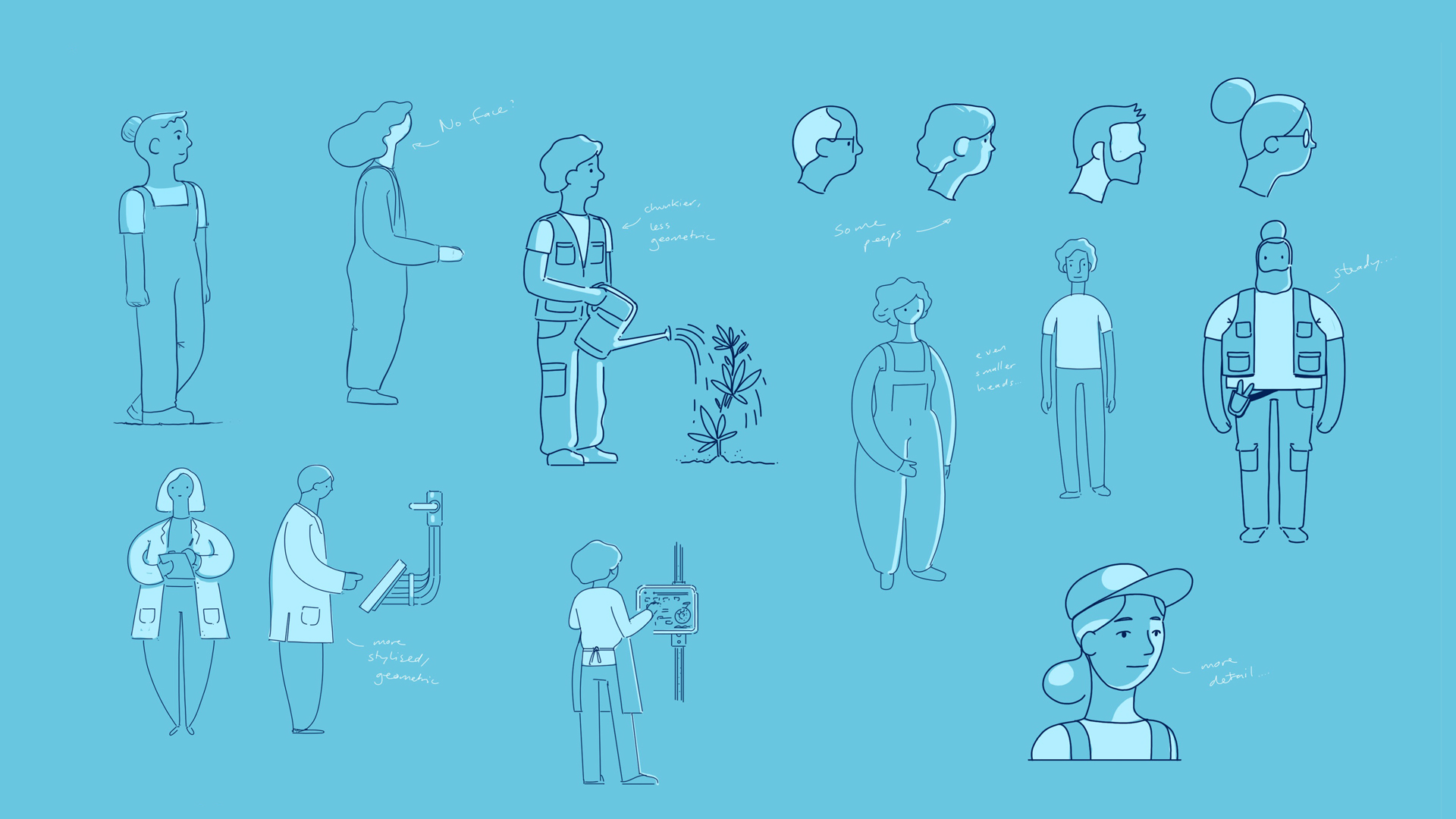
Character Design
The character development stage was very important for the campaign. The characters put a face to the team of people behind the science. As part of this, we focused on creating mini-worlds within the different departments, setting personalities for different types of characters to convey passion, purpose and warmth as opposed to a clinical, scientific approach.


Animation
Our choice of motion graphics animation style helped to create smooth transitions from one section to another - following Epidiolex from the greenhouse to the factory, to the bottle. This worked to build a seamless piece with flow and energy, helping to keep audiences engaged and key information digestible.


